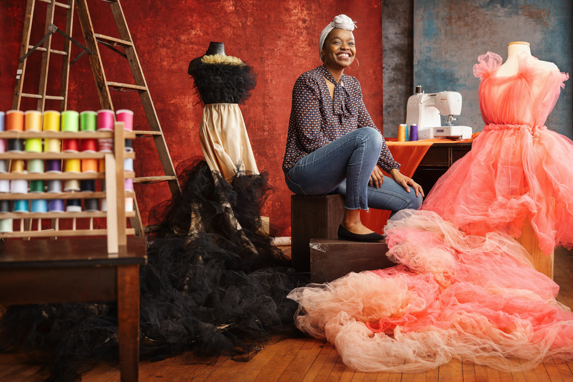
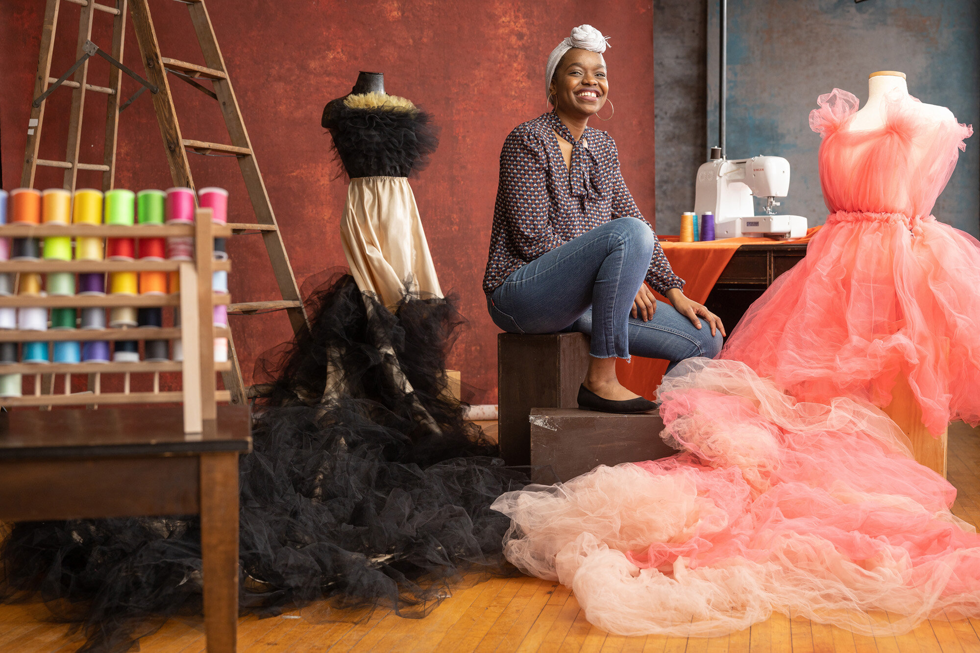
Retouching Philosophy
In a culture where special effects and photo manipulations are everywhere, the term “edit” is confusing without clarification. I want to give you a rundown of my retouching process to give you an accurate expectation for the finished product! There are different levels of attention to detail in an edit based on where the photo will live. A simple tone for an instagram post can be done in a minute using phone apps, but a professional edit for a full-res file can take 15-30 minutes of detail work to ensure an image looks flawless in final form.
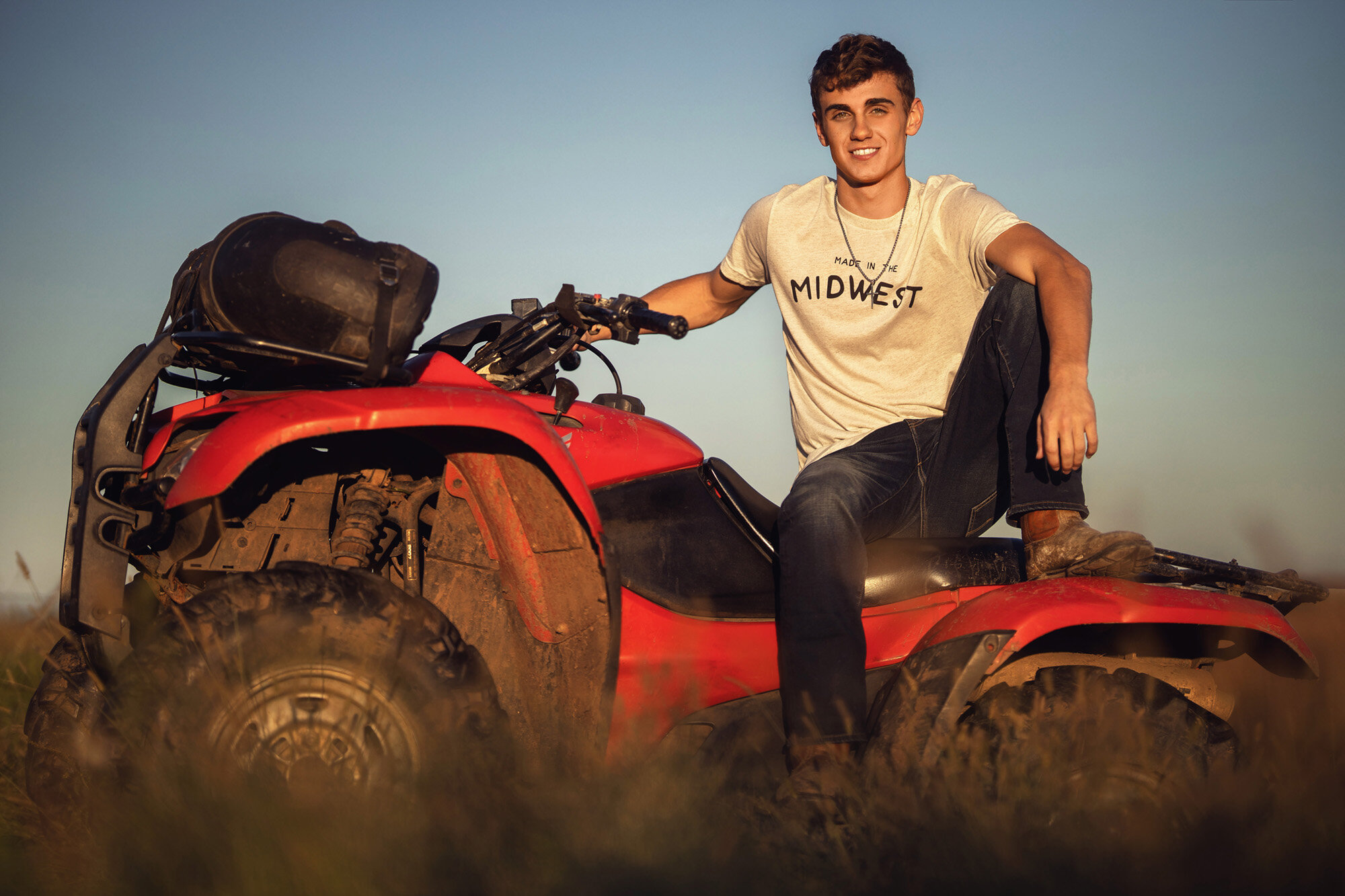
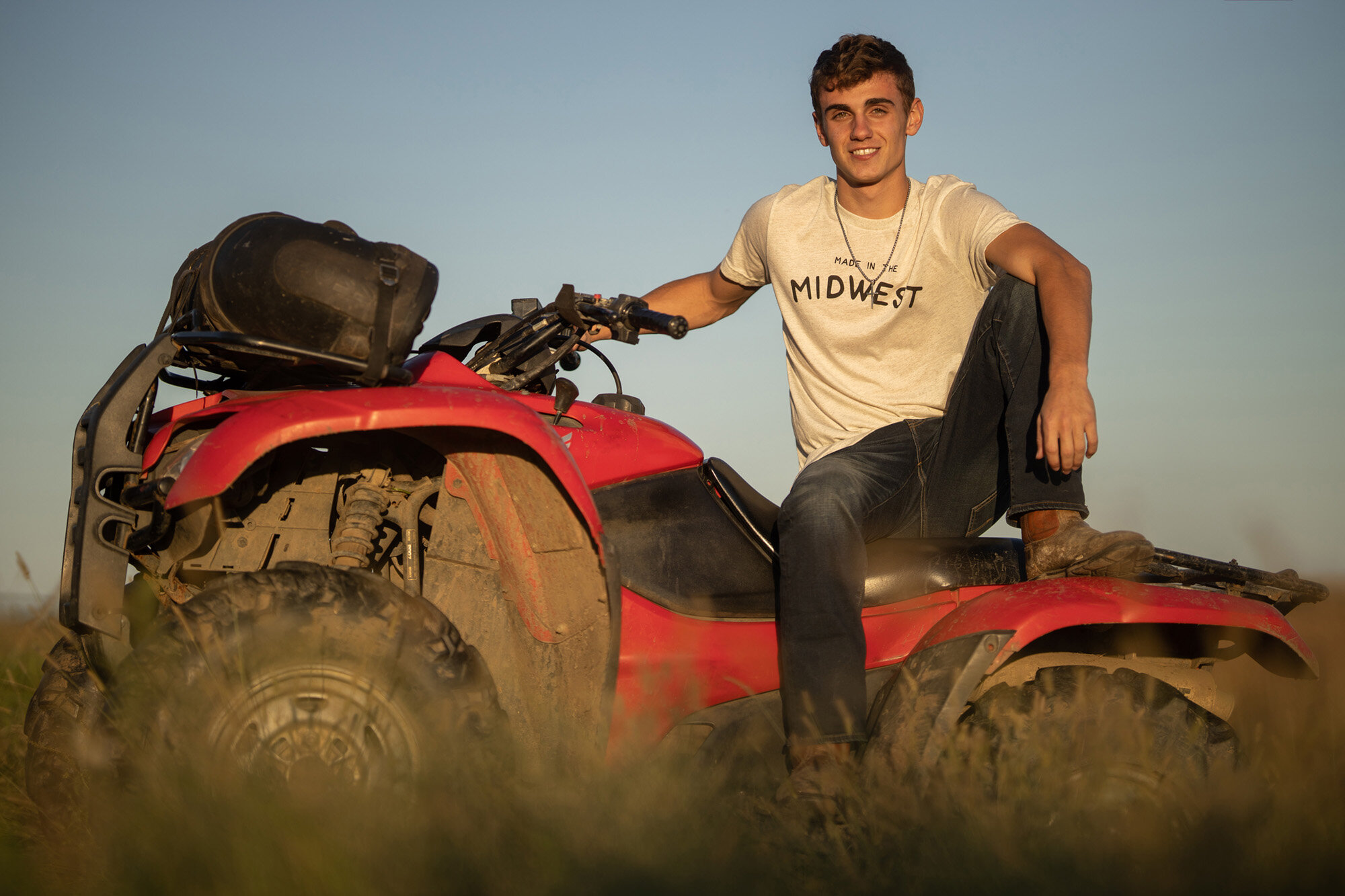
To give as much variety and choice to our clients as possible, we show un-retouched proofs from a session and then fully retouch the images that are chosen as “keepers.” The examples below will give you an idea of the difference between a proof and a professional retouch. I use lighting, posing and composition to construct a solid foundation upon which the edit can shine. I view the image creation process as baking a cake. The work created in-camera is the succulent cake that tastes great even without frosting. But edit is the frosting that enhances both the flavor and presentation of the cake. To be blunt: if you frost a turd, it’s still a turd. Both steps are necessary to create a truly masterful image.
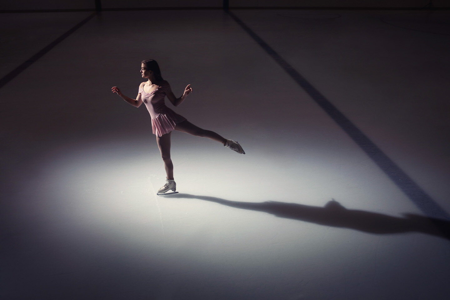
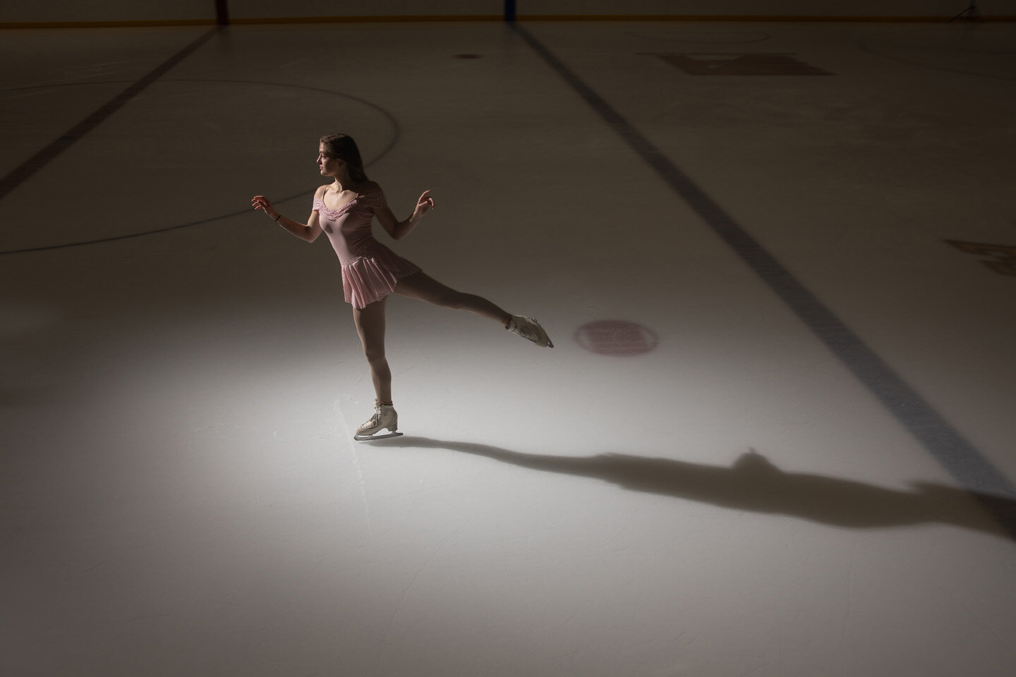
Object removal: If you squint at a picture until it goes slightly blurry, your eyes will notice the areas of most contrast. In a portrait, you want your eyes to go first to the subject and then to compositional elements that enhance the story. Often reality presents clutter and commotion that detracts from the subject in a portrait. Removing these distractions gives an image clarified impact. This example shows the removal of hockey iconography from the ice + color grade to better communicate the temperature of the scene:
In the studio it’s common to see background wrinkles, the edge of a background or a light from above in the proof stage. I usually shoot a little wide to ensure that I have the flexibility to have negative space in a composition or enough edge to be able to wrap an image as a canvas print. These things are easily tended to in Photoshop:
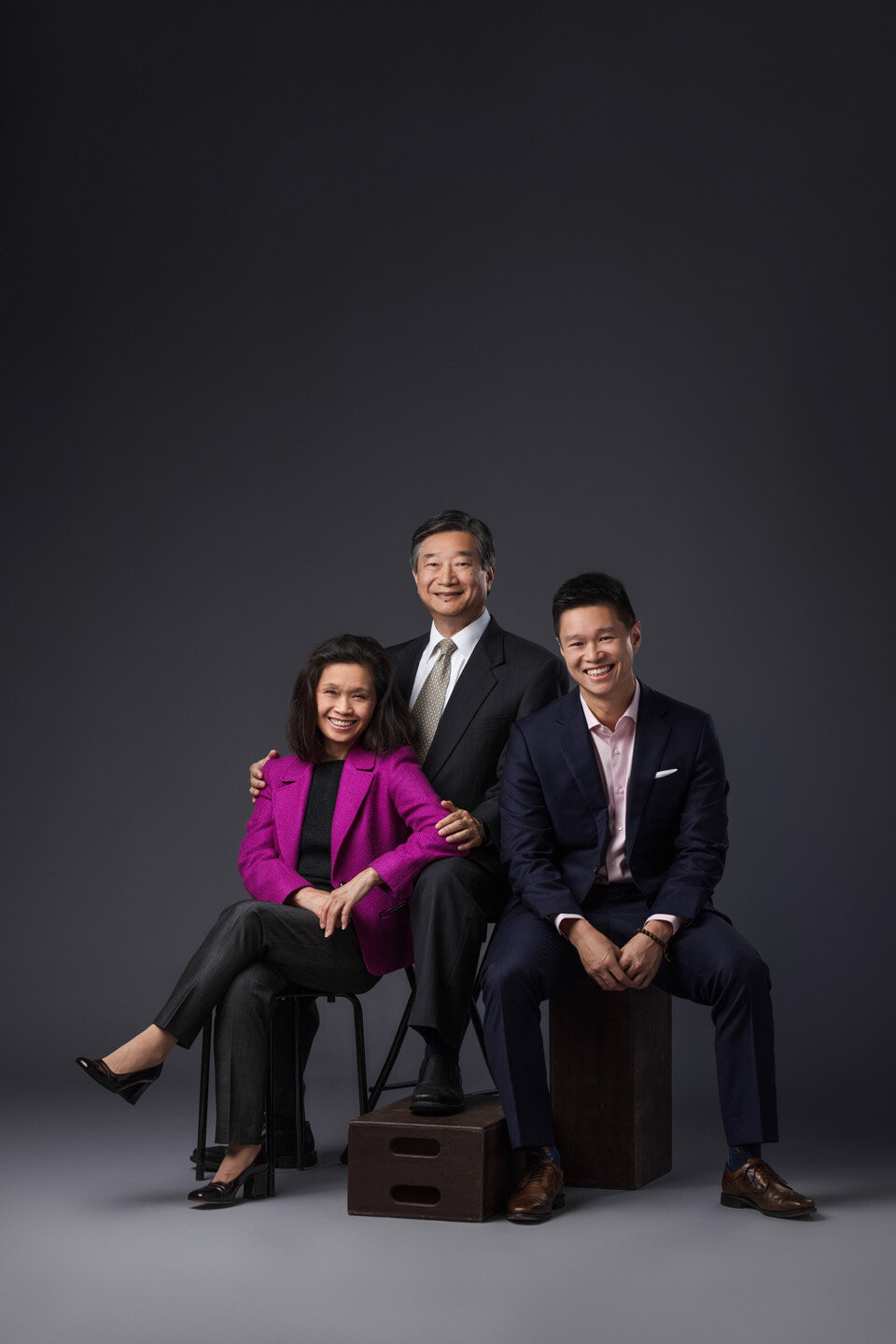
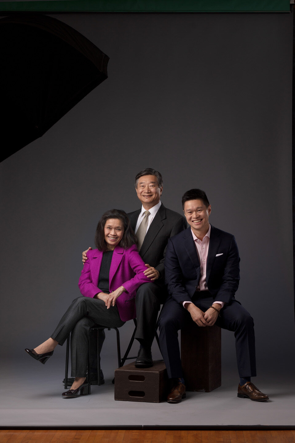
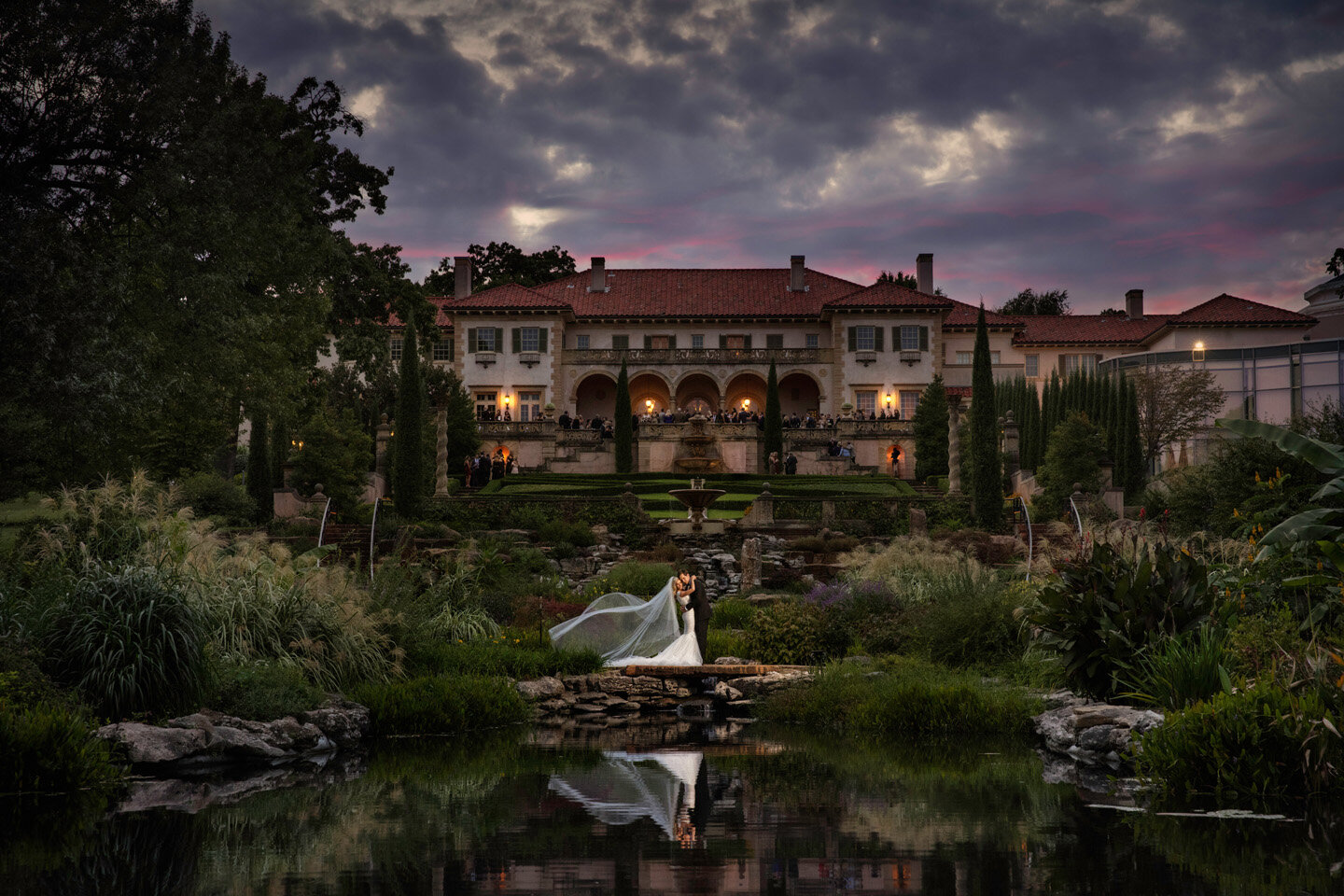
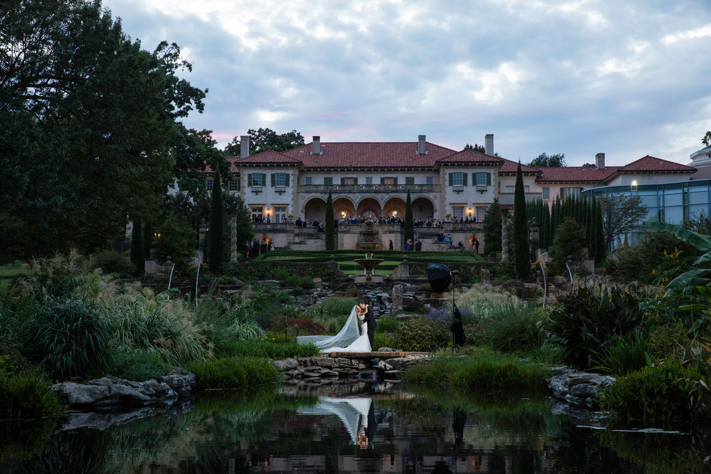
Oftentimes to ensure the most beautiful light on my subjects, I’ll capture my equipment in the frame. If you have a light or part of a stand in your frame, expect them to be removed in a finished image. Here’s an example where my assistant and my light had to be in my frame to properly light the couple, but were removed on the final image to create magic:
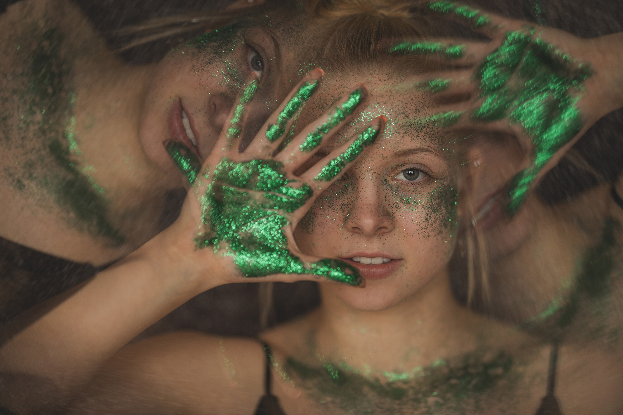
Skin: Many popular apps smooth skin and reshape body parts to the point where it doesn’t resemble reality at all. Rather than take shortcuts, we treat skin by hand using advanced techniques to remove blemishes while retaining natural skin texture so you look like the best version of yourself in a timeless and natural way. Anything that isn’t a permanent part of your face can go, but freckles, moles and birthmarks are part of one’s unique character and should be kept! Someday your kids and grandkids will look at your images through the lens of comparison so we feel strongly about keeping edits true to you.
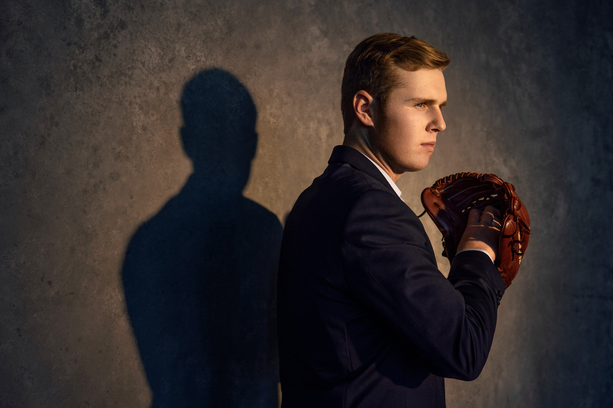
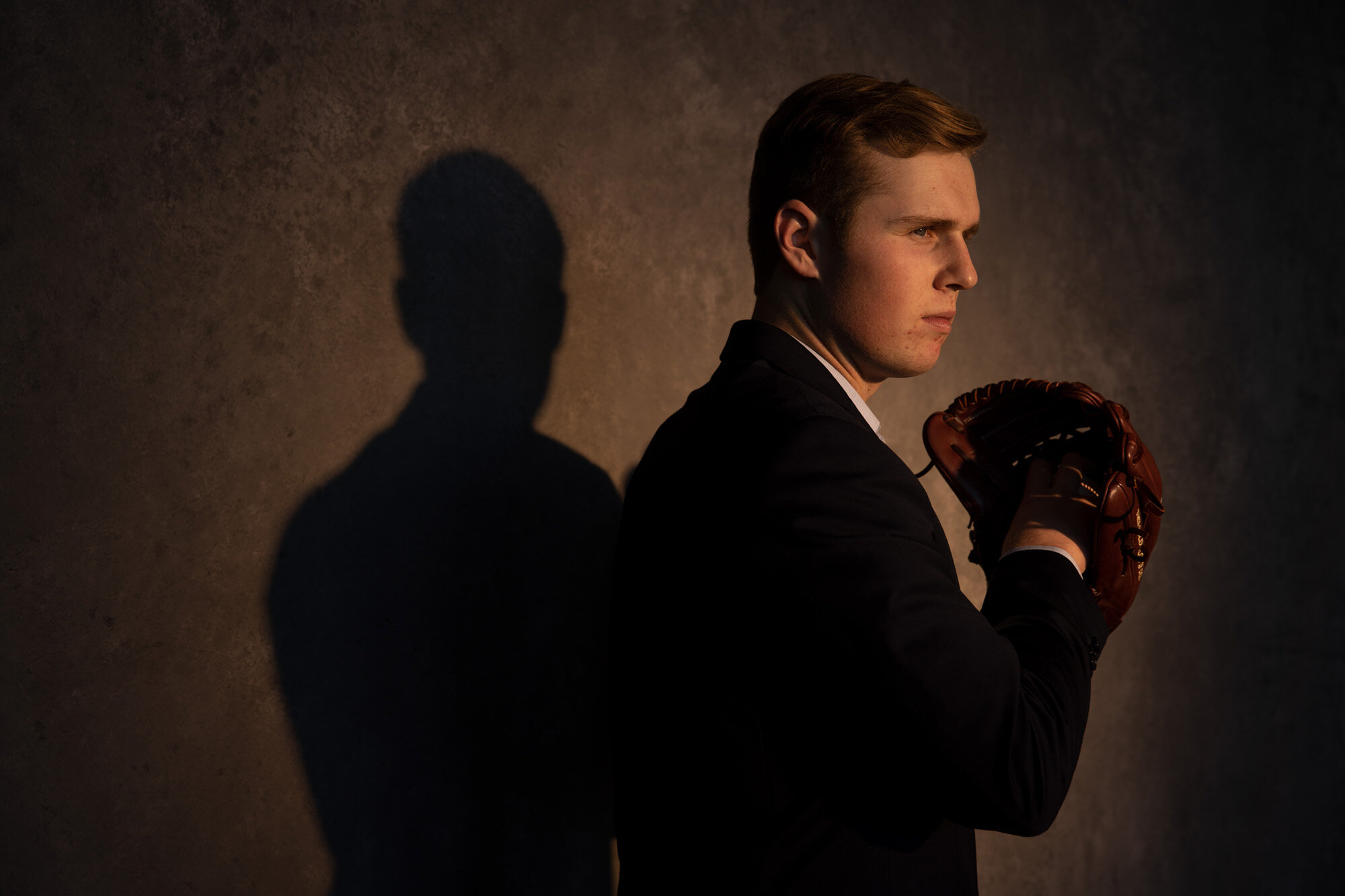
Dodging and Burning: This subtle technique has a huge effect on making an image look “finished.” Darkening distractions and brightening focal points guide the viewers eye exactly where you want it to be:
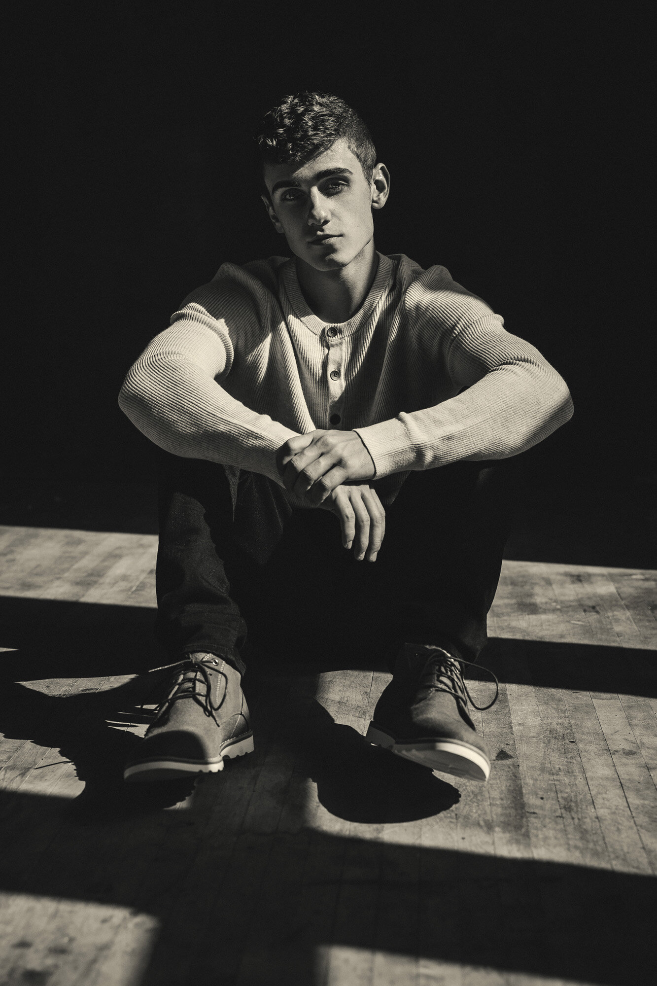
Black and White: We don’t always proof in black and white, but it does have a way of giving an image a timeless quality. Don’t hesitate to request black and white edits from your session! Here’s a look at my toning style:

Contrast: Often times I will shoot images to look “flat” (lacking contrast) so that I can micro-adjust how contrast affects specific parts of the image Photoshop. It’s much easier to add contrast to an image than it is to remove it. Here’s an example of a flat image converted to a finished image:
Distortion Correction: Often times I will use wide-angle lenses to capture the grandure of a location. This has a stretching effect on anything close to the edge of the frame, which can sometimes be a head or body part. This is easily fixed in photoshop and is worth the extra step to ensure an epic shot:


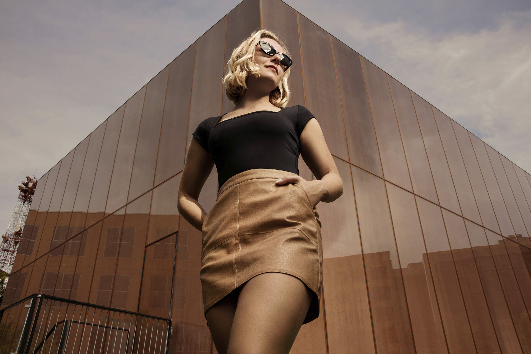
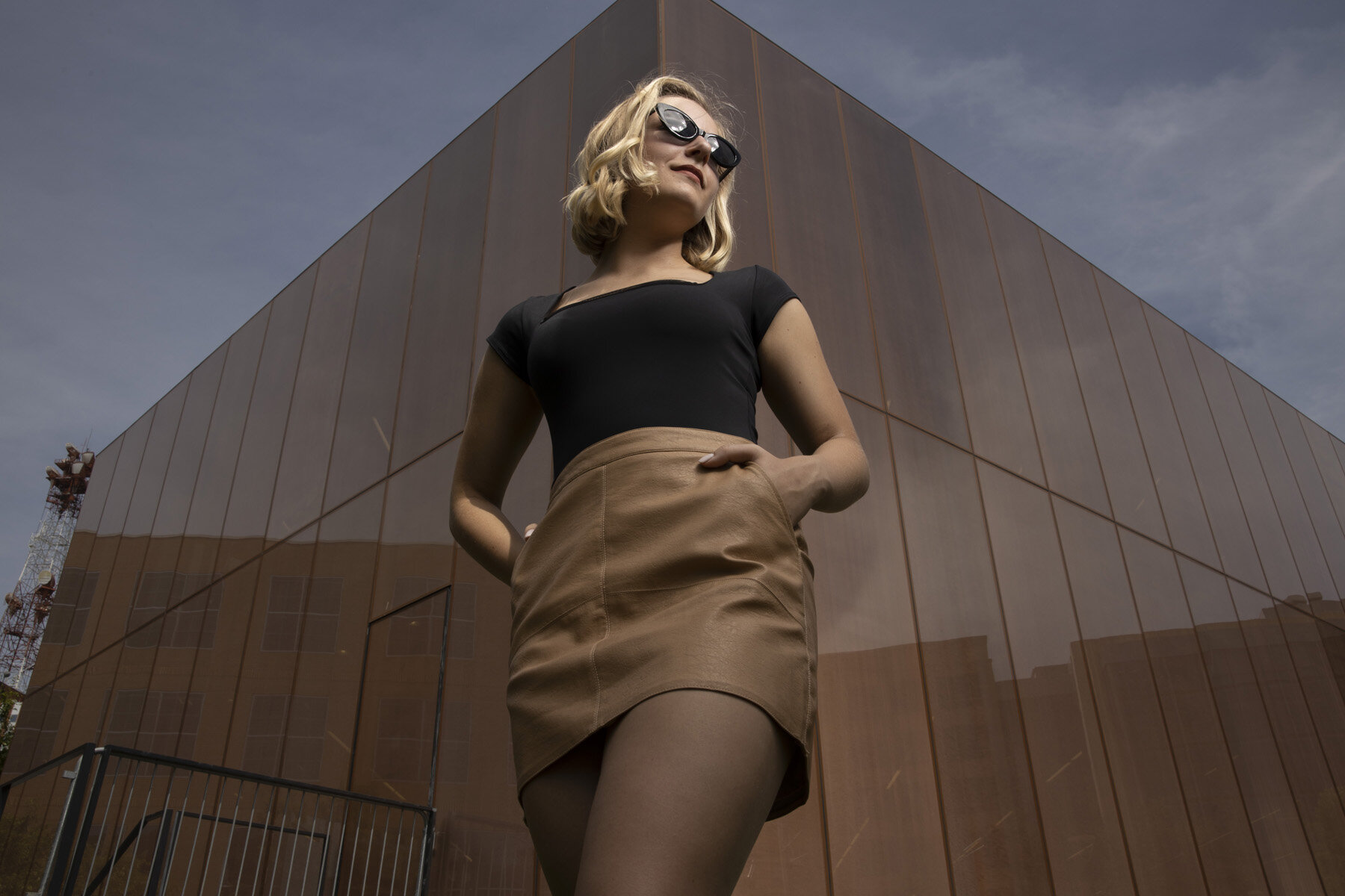
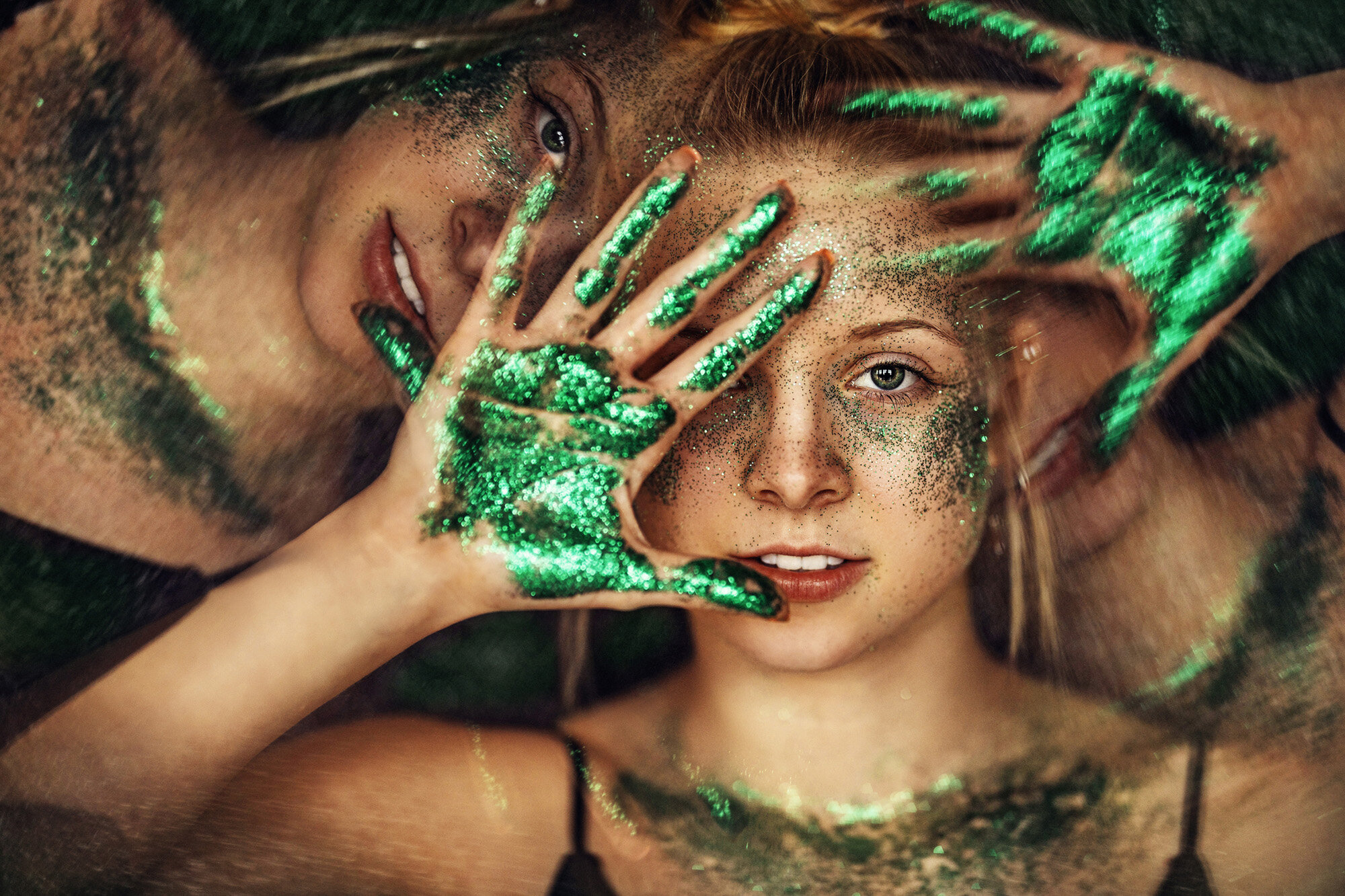
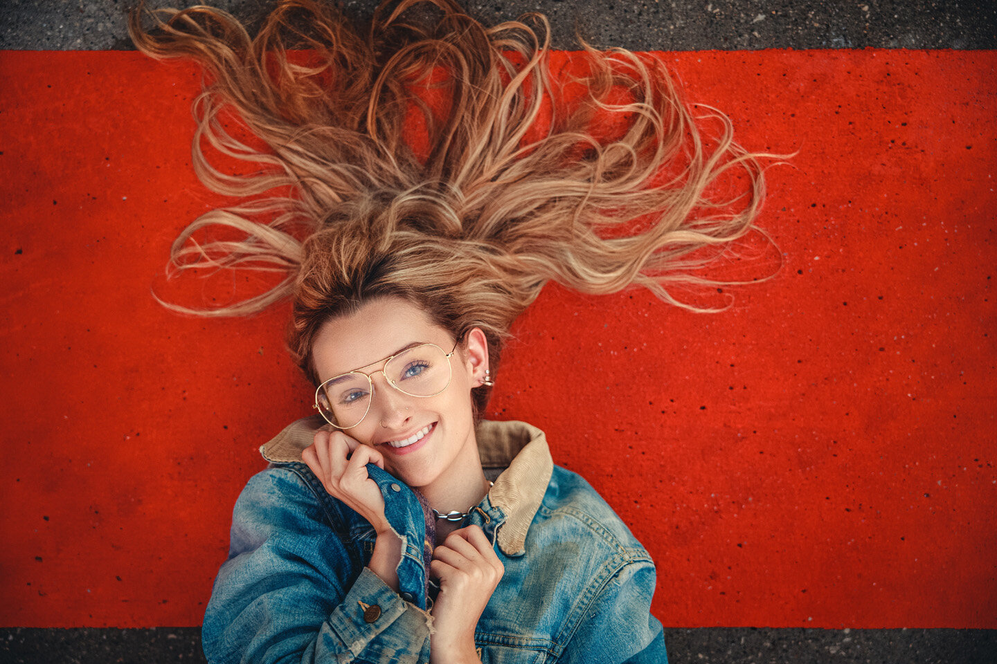
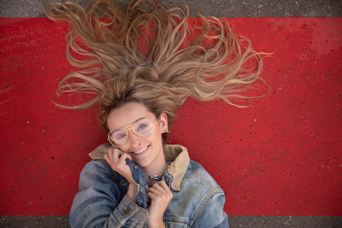
Color: Next time you watch a movie, pay close attention to the way scenes are color graded to make you feel specific emotions. Often times I’ll nudge or compress colors into palettes that enhance the underlying emotion of an image. I think of this as taking the musical notes of reality and nudging them into a more harmonious chord. Sometimes simply adjusting one note can make all the difference! The example below is also good example of removing glare from glasses.
Here the blue tones were decreased and the warm tones were compressed to create a monochromatic harmony between her skirt, skin, hair and background (the Des Moines library):